Help
- How do I use the platform?
- What can I do with the platform?
- I have a problem!
- Glossary
1. How do I use the platform?
Where is the administration panel?
- Find button "login" (top right)
- Login
- Login
How does it work?
- On the left: the menus. They are organized like this and like that
- The lists: select options and so on
- The lists: select options and so on
How to put a graph in the platform?
You have to do these steps:
- Ensure your graph is in the GEXF file format (Gephi is converting it)
- Upload your GEXF as a file in the platform
- Create a new graph
- Generate the database of this graph with your file
- Create a section if you do not already have one
- Attach your graph to your section
- Ensure your graph is in the GEXF file format (Gephi is converting it)
- Upload your GEXF as a file in the platform
- Create a new graph
- Generate the database of this graph with your file
- Create a section if you do not already have one
- Attach your graph to your section
How to upload a file?
How to create a new graph object?
- Click on the "Graphs" menu
- Create a new graph
- Generate a database with a file
- You can publish some attributes to visualize them and get statistics. More info there.
- You can modify it. More info there
- Create a new graph
- Generate a database with a file
- You can publish some attributes to visualize them and get statistics. More info there.
- You can modify it. More info there
How to create a new section?
- Click on the "Home" or "Sections" menu
- Create a new section where you can attach other things. More info there
- Create a new section where you can attach other things. More info there
How to modify a graph? ...file? ...section?
- Click on the item you want to modify
- You can change the name and other attributes, click "apply changes" afterwards
- You can edit attached items below
- You can change the name and other attributes, click "apply changes" afterwards
- You can edit attached items below
How to publish attributes?
- Select your graph for editing it
- If there is a database, click on "Publish Attributes"
- Each attribute has a menu. Select in this menu the way you want to publish it.
More info there.
- If there is a database, click on "Publish Attributes"
- Each attribute has a menu. Select in this menu the way you want to publish it.
More info there.
2. What can I do with the platform?
Publishing attributes
The platform allows to publish the attributes of nodes. What does it mean?
Your graph may have attributes describing nodes. These attributes can be textual, numeric, true/false or tags. Let's illustrate this with an imaginary social graph.
- The first name and the last name of a person are textual attributes.
- The age and the weight of a person are a numeric attribute.
- If someone owns a car is a boolean attribute (true/false)
- The hobbies of a person are a tag attribute. A tag attributes differ from textual attributes because you can "multi-tag". A person may have different hobbies, but has only one last name.
Note that these attributes are not specific to the concept of a graph. Edges do not matter at this point. If your graph has attributes describing edges, these will not be taken in account here.
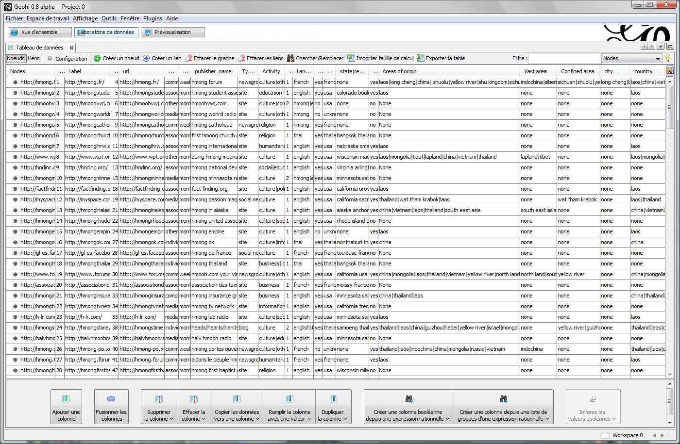
If you use Gephi, rely on the "Data Laboratory" panel to figure out what are the node attributes. In the nodes table, the nodes are the rows and the attributes are the columns. The cells are filled with text, true/false or figures, depending on their column.
The attributes do not appear by themselves in the platform. You have to take the decision to publish any attribute. The primary reason is that many attributes are not relevant for statistics (example: the "id" of nodes).
- If your attribute is a text descriptor, you should publish it as a partition. It is recommanded not to deal with too many partitions: we suggest you join minor parts as a unique "misc." or "others" part. See there how to do it.
- If your attribute is a tag, there is a specific publication format also named tag. More informations there.
- If your attribute is numeric, it is not handled for the moment.
- If you want your attribute to be published but not taken in account for statistics, use "Publish as a descriptor".
Publishing attributes is a good way to allow the statistical exploration of your data set. It is useful to understand how it is structured, to get measures expressing its properties, and to get charts that can be reused in another context (paper, poster...).
You can learn there how to interpret your data.
Making partitions
Select "Publish as a partition".
Each different value will appear in its own field.
You can rename a value (a part of your graph) and change its color.
Change every names/colors you want in the same attribute and click "Apply changes" to validate. This will impact the thumbnail of your graph (the little image below).
You can rename different values with the same name: they will be joined together.
You can write the colors as hex values or select the values you want in the palette. Just click on the colored rectangle to make it appear.
Colors are important because they will be used in every chart in the statistics. Choose carefully.
Making a partition will give you these informations:
For your attribute:
- How the values are distributed (bar chart, percent, count of nodes, more info there)
- The graph colored according your partition
- You can download the graph to put it back in Gephi
For each value:
- The Subgraph as a map and a downloadable graph file (gexf)
- How this part is connected to itself and to the others (more info there and there)
- The remarkable nodes, those that have a special role in the partition (more info there)
- How this part (value) is distributed in other ways to partition the graph and/or tag it (other attributes). More information there.
Making tags
Select "Publish as Tag".
Note that to do such a tag, the attribute needs to be in the "liststring" format in the gexf. Tags are then separated by a pipe character ("|").
As for a partition, each different tag appears in its own field. You can rename it and change its color. The only difference is that there are possibily multiple tags for each node.
As for attributes, if you rename several tags with the same name, they will become joined together.
Making a tag will give you these informations:
For your attribute, its Tag cloud.
For each tag:
- The subgraph as a map and downloadable graph file (gexf)
- How many nodes and edges are concerned
- The remarkable nodes, those that have a special role in the partition (more info there)
- How this tag is distributed in other ways to partition the graph and/or tag it (other attributes). More information there.
Interpreting statistics
The corpus represented by the graph is a relational dataset. It includes a classical dataset (nodes) with relations (edges).
The dataset as a table of entities can be explored by the statistics of tables: different partitions, how they overlap, what are the quantitative oppositions (there and there). The relational aspect adds a dimension about how different parts of the graph are connected together (there and there).
There is a plenty of figures and charts that can be produced even with a relatively small dataset. The platform will propose such an amount of statistics and organize them so that you can benefit from them.
Browsing the statistics helps to get a more accurate understanding of the graph (the "exploratory data analysis" perspective). It is about comparing parts of the graph by figures and charts in addition to the map. This shows different characteristics of the data and helps to find relevant facts. The map is useful to get a panorama gathering different aspects, while the statistics give insights and focuses. The platform ensures the continuity between global and local understandings.
You will benefit the most from the plaform if you are able to compare a lot (different values, different attributes, different statistics). Even if you are not familiar with this process, you will be able to get measures for any observation made on the map. This is the interpretation process we will explain here.
Quantitative aspect of the graph
If you use the platform as a tool for interpreting data, your first step will be to deal with:
- how the entities are described in the dataset
- the most represented categories
- some obvious content-structure correlations
- how the entities are described in the dataset
- the most represented categories
- some obvious content-structure correlations
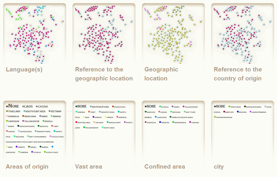
The first thing you see is a list of the different attributes, as mini-maps or tag clouds. It is mainly a portal page to navigate to the attributes statistics, but it is possible to get some informations.
It is possible to compare the mini-maps to find attributes that share the same distribution, and to track content-structure correlations.
It is possible to compare the mini-maps to find attributes that share the same distribution, and to track content-structure correlations.

Simple content-structure correlations appear as zones where nodes share the same color. These correlations are very important because they allow to interpret the links.
Clicking on a mini-map allows to explore the attribute.
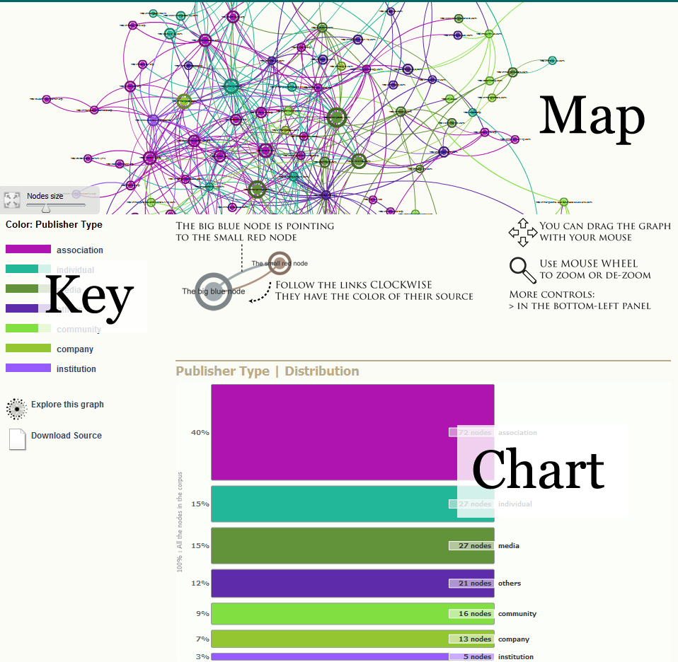
The dedicated page includes a map as well as a chart. Most of the statistics pages are organized like that.
Note that the colors defined in "Publish Attributes" (in the admin panel) are used is the map and its key as well as in the chart.
Clicking on the map key or the chart leads to the statistics of each part of the partition.
The map features a fullscreen mode, and it is possible to zoom (mouse roll) and move (drag the background).
Content-structure correlations appear more clearly and can be interpreted. The map allows to see the links and the nodes' labels.
- We assume that the graph is spatialized (by a layout like ForceAtlas in Gephi). If it is the case, we expect that the nodes that are close are directly or indirectly connected.
- If there is a colored zone then it means that nodes that share some criteria (the value giving the color) tend to gather, to be more linked together.
- It is necessary to check in the map that there are links explaining the proximity of the nodes. The spatialization is never perfect.
- The statistics of this part of the graph (the value giving the color) will give measures expressing the correlation (more informations there).
The content-structure correlation sometimes explain the links. It is the case when the common criteria is well known. For example we expect blogs to be more densely connected together.
Sometimes it is the contrary and the links explain the categories. For example we can learn that such type of actors make a community while such other type doesn't. Of course, this type of conclusions have to be confirmed by a more qualitative work.
In both cases, content-structure correlations give strong indications on which aspect of the data would benefit from a further investigation.
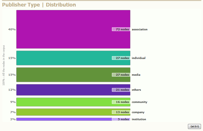
The chart indicates how the categories are balanced. It indicates absolute values (how many nodes as well as relative values (percent of the corpus).
If your browser is standard compliant, click on the "Get SVG" button and you'll get the chart as a SVG file that you can save for later use (include it in a paper or powerpoint, edit it with Inkscape or Illustrator).
These informations are simple but should not be disregarded. How each attribute is distributed amongst the graph is an important result about the heterogeneity / the homogeneity of the corpus. These figures have to be discussed according to how the corpus was sampled.
The connectivity profile of a part of the graph
Clicking on a specific value for a given attribute leads to a specific page.
Because the attribute is a partition, we call the nodes concerned "a part of the graph".
The top of this page includes important information about how this part of the graph is linked.
Because the attribute is a partition, we call the nodes concerned "a part of the graph".
The top of this page includes important information about how this part of the graph is linked.

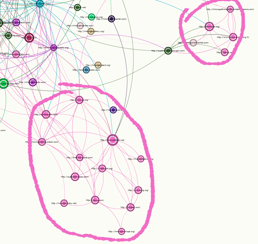
On the top of the page, there is a map representing only the nodes that have the requested value (for the given attribute) and the edges between these nodes. This graph is called a subgraph.
Note that the nodes have the same position as in the whole graph (and the same single color).
In this map we can see how the subgraph is structured. These questions should be addressed:
- Is the graph dense or not?
- Is there one ore more agregates?
- Are there many disconnected nodes?
- Are there visible hubs and/or authorities?
Some of these questions can be answered with figures (see below).
If the subgraph is a dense agregate, then it is a strong sign that it indicates a community.
If there are several agregates, this fact should be explained. Is there another attribute that "senses" this aspect of the structure? If not, this might lead to redefining the categories.
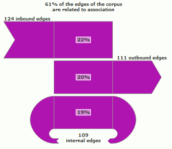
The connectivity profile of the graph is represented by a chart in three parts:
- The inbound edges: how many edges of the graph point from outside the subgraph to it
- The outbound edges: how many edges of the graph point from the subgraph to outside it
- The internal edges: how many edges of the graph point from the subgraph to it
You can compare the inbound and the outbound. In most cases, inbound edges are more valuable than outbound edges. Thus you can estimate the connectivity capital of the subgraph:
- "in profit" if inbound > outbound
- "in deficit" if outbound > inbound.
It is very important to compare the parts of the graph and identify those that have the most "profit" of edges (inbound compared to outbound). This hierarchy often has a meaning.
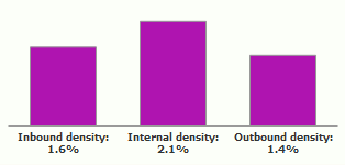
For comparing the amount of edges themselves (and not only the in/out balance) it is necessary to use the densities chart.
A density of edges is how much actual edges there are in proportion to the possible edges that could exist.
It is important to use densities when parts of the graph have very different sizes. 100 internal edges is a lot if the part has 20 nodes, but is few if the part has 1000 nodes. Densities take sizes in account and thus allow to compare the different parts.
Important:
All the connectivity profile charts of the same attribute have the same calibration, and thus can be compared.
How different parts are connected
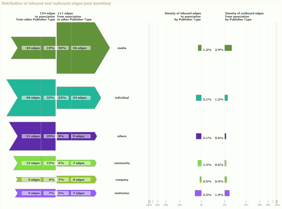
Below the connectivity profile is the distribution of inbound and outbound edges.
This chart gives informations about how this part is linked to the other parts.
You can compare which parts bring more edges than they take and which parts take more edges than they bring. Asymmetries often denote hierarchical relations between parts (the dominant part gets more edges). The extreme case of unidirectional relation is not rare.
Because of the different sizes of the parts, comparison of the parts should be done with the densities. These are represented in the right part of this chart.
These charts allow to find privileged links between some parts, as well as structural holes (lacks of links between some parts). These can also be seen in the map, but here you can get the measure.
Important:
These charts also have the same calibration, and thus can be compared (in the same attribute).
Remarkable nodes
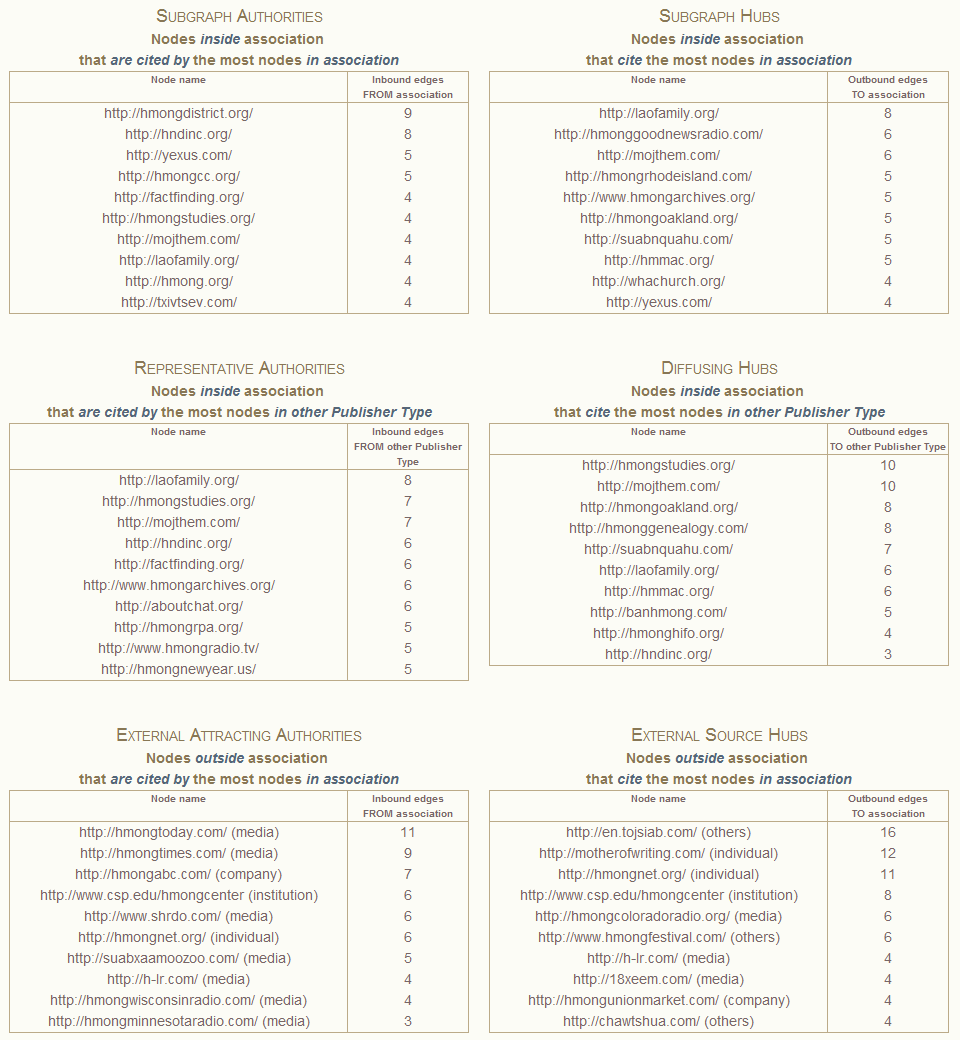
We usually consider authority (being cited) as a remarkable feature. In web or social graph, it denotes notoriety.
This is because we consider that it is more difficult to get links (to be cited) than to give links (to cite). The value lies in getting access. That's why we want to identify the nodes that are cited the most. The information about who cites is nevertheless interesting and we also provide it.
The remarkable nodes allow to identify different roles in the structure. These roles differ because "being known in your community is not like being known outside your community".
a) Remarkable nodes in the subgraph
- Subgraph autorities represent the notorious nodes in the group. They are the authorities of the subgraph (authority in the sense of indegree). They gather the most part of the connectivity capital from this part of the graph. Very relevant when the part of the graph is a community.
- Subgraph hubs represent the "portals" to the group. They are the hubs of the subgraph (hub in the sense of outdegree). They bring access inside this part of the graph.
b) Nodes in this part of the graph, remarkable because the rest of the graph
- Representatives authorities are external authorities, representant of the community, acknowledged by the public. These nodes are in the part of the graph but cited by nodes that are outside of the graph. They gather connectivity capital from outside the part of the graph.
- Diffusing Hubs are bridges to other categories, they are nodes in this part of the graph that cited many nodes outside this part. It is important to look if they point to different other parts (then bridging multiple parts) or one other part (and thus denote a privileged bond between two parts).
c) Nodes in the rest of the graph, remarkable because of this part
- External attracting authorities are the nodes acknowledged by the group outside of it. They are external references. They gather the community capital of the group outside of it.
- External source hub are nodes, outside the group, that acknowledge the group.
NB: You can read the part of the graph these nodes belong to (in parenthesis). It is important to look at these groups (other values for the same attribute). They may explain why some other parts are strongly connected to this part.
Who is who: how different attributes overlap
In the page dedicated to a part of the graph (a given value for a given attribute) there are the crossings with all the other published attributes.
These charts and figures give informations about how a critieria could correspond to other criterias.
Simple example: We have a social graph where people are described by two attributes: "gender" (woman, man) and "makes sport" (yes, no, unknown). In the page dedicated to women, we will know how many of them do sport or not, and we will compare to how it is in the whole corpus. We could also compare it to how it is for men (this chart would be in the page dedicated to men).
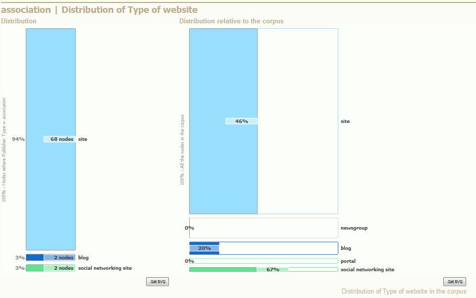
The left chart gives the distribution of the current part of the graph along a the secondary partition.
How many nodes of this part take each different value of the secondary attribute. This information can be used to compare different parts of the graph.
- In our example (illustration on the left) the current part of the graph is nodes where "Publisher Type" is "Association". This information is written vertically on the left of the graph.
- The 72 nodes of this part are distributed along a secondary attribute, that is "Type of website" (written on the top)
- 68 nodes of "Association" have the "Type of website" "site", and it represents 94% of this part (the part "Association").
The right chart gives the distribution relative to the corpus of the current part of the graph along a the secondary partition. This chart is more complicated:
- The count of nodes is exactly the same as in the left part of the graph, that's why it does not appear there. In our example, the lightblue rectangle also represents nodes from the part "Association" where "Type of website" is "site", and we know that there are 68 of them.
- The percent represents the percent of the current part in the secondary part, that is the inverse of the previous percent. In our example, it represents the percent of "Association" in "site": 40% of nodes where "Type of website" is "site" have a "Publisher type" "Association".
- The vertical axis represents the distribution of the secondary attribute (here "Type of website") in the whole corpus.
- The horizontal axis represents the percent of current part (here "Association") relative to each secondary value (ex.: "site") in the whole corpus.
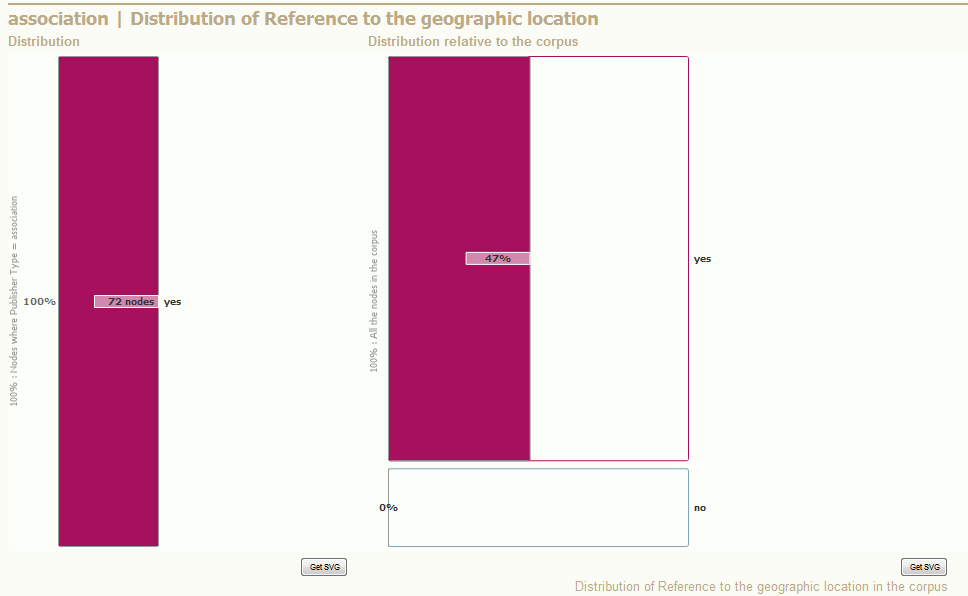
We can use these charts to identify if some parts share characteristics.
This can be achieved with the comparison of the left chart and the right chart.
- The empty parts of the right chart are interesting. They mean that some types of nodes are totally disjoint (No "Association" has a "Geographic location" equal to "No" in this graph).
- When there is only one category in the left chart, it leads to a similar conclusion (here: every "Association" has a "Geographic location" equal to "yes").
- The reverse can also be observed, when a rectangle in the right chart is full
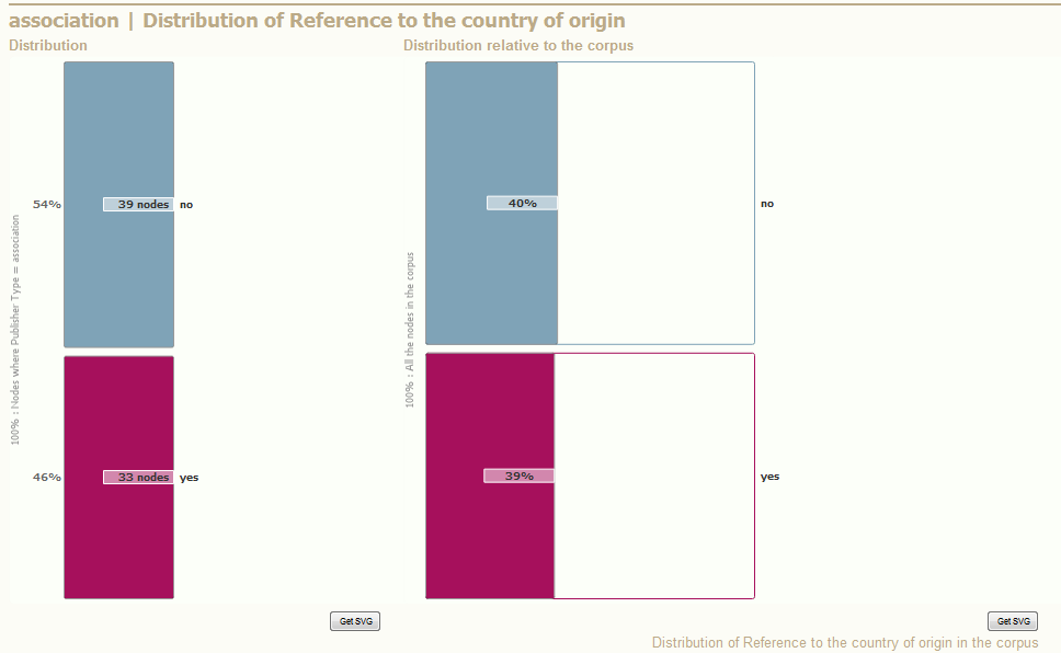
- When the right chart is similar to the left chart, it means that the current part of the graph is distributed like the rest of the corpus.
3. I have a problem!
(Work in progress)4. Glossary
Attribute: In this platform, there are attributes only for nodes. Attributes can be textual (ex: last name), numeric (ex: age, weight), boolean (ex: can drive) or tag (ex: several hobbies).
Textual attributes are used to build partitions of the graph. Example: if you take all the nodes with the attribute "last name" valued "Simpson", you will have the subgraph of the Simpsom family. You can also put colors according to each possible value.
Boolean attributes and some numeric attributes (those with entire values like 1, 2, 3...) can also be used to build a partition.
Tags do not do partitions (because you can have several tags for a given node) but still do subgraphs.
The platform will tell you how different partitions cross and/or are connected. More information there.
Degree: For a given node, the number of edges connected to it.
The indegree is the count of edges pointing to a given node.
The outdegree is the count of edges starting from a given node.
The indegree is the count of edges pointing to a given node.
The outdegree is the count of edges starting from a given node.
Density: How many edges there are compared to how many edges there could be. Between 0 (no edge) and 1 (all edges possible), it is often expressed as a percent. It is a better measure than the simple count of edges because it takes in account the number of nodes. This definition applies differently depending of the cases:
The density of a graph or subgraph, is 0 if there are no edge and 1 if there are all possible edges (every pair of nodes is connected: it's a clique).
If there are n nodes, there could be n(n-1)/2 edges in a undirected graph and n(n-1) edges in a directed graph.
- Density in an undirected graph of n nodes and e edges is d = 2e / [n(n-1)]
- Density in a directed graph of n nodes and e edges is d = e / [n(n-1)]
We can compute a density for any set of edges.
The common case is the density of edges between two sets of nodes. This is about how a part of the graph is connected to another part of the graph. The density is 0 if no node of the part 1 is connected to any node of the part 2, and is 1 if every node of the part 1 is connected to every node of the part 2.
The method is the same. A set of n nodes can have, with another set of m nodes, a maximal amount of edges equal to n.m/2 (undirected) or n.m (directed). Thus:
- Density between n nodes and m distinct nodes (in an undirected graph) is d = 2e / [n.m]
- Density between n nodes and m distinct nodes (in a directed graph) is d = e / [n.m]
Edge: The connection between two nodes. Also called "link" sometimes. Edges may have attributes, but these are not managed by the platform.
Edges can be directed (like "who loves who", assymmetric) or undirected (like "who shakes whose hand", symmetric).
Edges are visualized by lines or curves. In the plaform, the edges are curved and "turn clockwise": follow an edge, if it turns clockwise, then you go from source to target node(if it turns counterclockwise, you go from the target to the source node).
Graph: A set of nodes connected by edges. Example: a social network, where people are represented by nodes, and acquaintance by edges.
A graph is a mathematical being but can be represented as dots (or any other shape) connected by lines (or curves).
A graph is a mathematical being but can be represented as dots (or any other shape) connected by lines (or curves).
Node: The element representing an entity, usually visualized as a circle, a dot or any other shape. Sometimes called "vertice".
The nodes are the element that populate your data. They are described by attributes, connected by edges.
In a social graph, the nodes are the persons. In a web graph, they usually are websites.
The nodes are the element that populate your data. They are described by attributes, connected by edges.
In a social graph, the nodes are the persons. In a web graph, they usually are websites.